This question was put to me and several other designers at a function recently. Magazines have truthfully lost some of their flair in recent years, what with the wealth of online options. Pinterest was brought up as a source, but my colleague was fishing for something fresh. The other designers and I seems to lack freshness when put on the spot. Now I think I have my answer. While both Pinterest and magazines (the slim Contract magazine getting more of my attention than the gorgeous and much fatter Interior Design) do play a role I think there’s been something even more ingrained in my psyche.
I get my inspiration on “field trips.” At one time, when I was in school and studying abroad that meant literal field trips. My Danish Institute of Study Abroad program was huge on visiting the sites of great architecture and seeing it for yourself. Even more so; they were huge on not just taking your own pictures and seeing the places with your own eyes, but drawing it for yourself. What I learned that summer and what I took away from that program changed the way I have approached design since. (I would highly recommend the program to any students). When I returned home I spent extra time to visit places related to my projects and get my feet and hands on the ground. There was a time (still in school and the year or so immediately after) where a staple of my purse was a small sketchbook.
My “field trips” now are more the spontaneous finds in my daily (and not so daily) travels. Today I don’t carry a notebook everywhere and sketch my observations, but I do have a smartphone. When I scroll through my pictures there I have a strange assortment of pictures that often include no people whatsoever. Photos of porcelain tiles, of building columns, of flower arrangements, of a cool combination of colors, of murals, of hotel room bathrooms and dozens of other things that make me happy to look at, remind me of ideas and help shape my latest projects. So I suggest to you to use your phone, not only for selfies and food shots, but to record the details of places as they inspire you.
Green and sustainability has become an increasingly important concept to design, especially since the US Green Building Council and its LEED (Leadership in Energy & Environmental Design) certification system has become so prevalent. Like the “Three R’s” (Reduce, Reuse and Recycle) that many of us grew up on, this system encourages the innovation of sustainable and green practices in buildings. Extra points are also available for dreaming up new ways to do it! This credentialing system has been adopted by various Federal and State jurisdictions as minimum requirements for new buildings under their purview; a forward-thinking practice. There are other similar rating systems you might run across and all incorporate incentives for reuse of previously developed land, parts of old building, re-manufactured products, reclaimed wood and a variety of other “Three R’s” related stuff.
But today is January 2, so while I’m a proponent of the reclaimed wood and the reuse and repurposing movement, I want to point out the other side and the advantages of the New. There are times where reuse is just not always the best option and something new is needed in any space.
Reupholstering furniture, for example, is not an option that we often recommend to our clients. It sometimes is brought up by clients in an attempt to cut down on a budget, and the assumption is reusing a piece with a new fabric will be less than buying a whole new piece. This is sadly not true. Reupholstering an old piece is usually comparable to buying a new piece of furniture. Go ahead and feel good about buying new when it comes to sofa, loveseats and fully upholstered chairs.
New appliances and toilets are another good idea. Even the LEED systems agree; reusing an older toilet (particularly those from before 1994, as that was a major year for the minimum requirements of plumbing fixtures) isn’t worthwhile. These older fixture use more water per flush or more water per minute than their new counterparts. Since efficiency is definitely part of the game, these are items worth the investment. Much the same is true about new appliances. Every few years the energy efficiency improves and you can get more cleaning/cooling/heating for less power.
A fresh look is still, always a coat of paint or stain away. The newest lines of paints can also come with low or no VOCs to do away with the new paint smell (alas, stains and varnishes don’t really have this option) but get the look easy. Also, if you take a good look at a wall a few years old, it might be in need of some freshening in terms of filling some dents or sanding away old paint drips. With paint or stain, a little can go a long way.
So with those few pearls of “new” wisdom Happy New Year, from our family to yours!
I’ve recently come to understand a universal truth about people and the perception of interior spaces. There’s an odd dichotomy between the way we (I include myself in this) think about our homes in comparison to other spaces and the way the code books (and therefore the education of Architects and Designers) treat our homes compared to other spaces. The short version is that while most people think of their home as the most important space in their life, the code books give residential spaces, as a category, much less attention and consideration than they do other spaces. So while our residences have an importance of a 10 to us, the International Building Code (IBC) probably would rate your home about a 3 in importance.
When you consider the purpose of these codes it makes sense. The books are written and then referenced into law to protect the health safety and welfare (much of this is related to protecting people in case of a fire) of the largest number of people possible. They express a minimum level of risk in an environment that the public, any public, should be exposed to (without the need for signing a disclaimer, like you do before engaging in more risky activities, like a paintball arena). Because codes are written to avoid risk to the public, it is more concerned with and spends a lot more time codifying large spaces with lots of people, and how to get them out of a building safely in case of a fire. It’s a matter of scale. Getting thousands of people out of a hospital in the event of a fire is a lot more challenging than getting a family of 5 out of their home. While avoiding fires in both buildings is preferable, the number of chemicals and flammable objects in the hospital is more strictly controlled because the ramifications of a hospital ever having a fire can affect so many more people.
This isn’t so suggest your home isn’t important. It is. Your home is probably the only space in your life where you have complete (or almost complete) control over the space: what and who is allowed in, where things are located, the overall feel, colors and cleanliness of the space are whole yours. There are good reasons that our homes are our most important spaces. I only mean to suggest when a designer is helping you to pick, lets say drapes, they come from a world with oodles of rules and codes governing drapes in a hospital; none of which apply to a residence. You can construct a drape made of matchsticks (could be pretty cool in a the sense of making a woven material from small sticks). It wouldn’t be advisable but there’s no one to stop you.
The bottom line is when I’m asked about the appropriateness of a material, like a type of carpet, for someone’s home, I usually have to go research the material proposed. Because while I may know straight off that I would never use that carpet for a hospital (solution dyed nylon with a moisture barrier backing all the way!), I often have to double-check its properties to know if its good in a home. Odds are, it’s probably fine.
I recently had a very interesting conversation with a design colleague regarding certain dispensary businesses in Colorado. I will leave that at that. But the conversation led me to start considering what interior designers bring to spaces that is not just aesthetic appeal, not just space planning or spatially related, but an architecture of Professionalism.
To digress for a moment, one of my husband’s favorite places to eat is a tiny little strip mall, hole-in-the-wall Pho place. We love this joint and would argue there is no place to equal it in terms of Pho for miles. But it is a hole-in-the-wall. The tables and booth are beat up utilitarian pieces, the bathroom is a little frightening (better avoided) and while the kitchen produces some of the most amazing food ever there is something to be desired. It is family business in terms of being a little slap-dash and the interiors are put together a little haphazardly. This in no way changes the fact that they are well known for what they do well and the repeat clientele proves it. I’m in no way suggesting they change anything there!
But, what would this place be like if it looked, really looked, like a professional restaurant owner and operated by a serious restauranteur? If that hole-in-the-wall face that belies the greatness of the cooking were brought to match the quality found within, how many more people would be enticed to enter? How would their business change? Perhaps I choose a bad example, because the hole-in-the-wall with amazing food is its own archetype, but I think there’s something to be said for having the space receive a similar investment as the food. Making that investment in a look and functionality says something about the business behind the face and that’s the point I want to make.
Hiring a professional, any professional, to assist in a portion of your business practice says that you, as a business owner/stakeholder, care to see it done right and in concert with the message you want to send. Whether it be an IT professional, an accountant, or a designer these are people who are experienced in their professional arena and can guide you to make decisions that reflect the values of your business. In the case of a design professional, we take it one step further and translate those values into a form that your customers really SEE. It’s branding and marketing, this investment in how your space looks, and it tells other people something about your business. At the most basic level, the investment of a space implies the legitimacy of a business with overhead business expenses and taxes tied back to a space and its proprietors. What that space says is up to you and a design professional helps you make that decision in a mindful, meaningful way, rather than as an afterthought.
My family Pho business’s interiors say (once you’ve had the food) that they are more concerned with the kitchen and what comes out of it than anything else. That’s not a bad thing. But how many hungry potential clients have walked right by without a second thought because they just didn’t know better? An investment in the space shows people visually that there’s an investment in the business. Because we’re talking about a restaurant, that suggests to people there’s something great going on in the kitchen.
This was the same point my colleague was making about certain Colorado businesses. As these businesses cater to the healthcare industry they need to look the part. A designer is very much a part of that equation and differentiating them from their neighbors. When the services of a designer are considered in this light, they are not only providing physical space, but a sense of Professionalism and Legitimacy.
As a designer, I have had a lot of time to look at products, trends, colors. It means that I have long since lost any attachment to say dark wood over light wood. I like both in the right context. Same with the sterility of the International Style or the more lavish Federalist. Both have a time and a place and both can be an equally inspiring basis for the style of a law office.
Yet I need to choose my words very carefully when describing styles or colors with a client. The word trend is a particularly dangerous thing to put out and I’d like to explain why I think that is, even through a trend is nothing to fear. It’s just a currently popular idea. There’s a delicate balance in every job to provide both freshness and longevity. Clients are usually coming in having lived with a space for years and part of my job besides function is to provide a facelift. Yes, creating the functional conference room that the team desperately needs is important and rebalanced the lights and HVAC after those walls go up is necessary, but part of the appeal of an interior designer is that you expect us to leave the place looking better than when we were hired, not just functioning better. (Like the roof replacement my husband and I did last year; it needed doing, but we didn’t “feel” or “see” the investment except by the absence of rain in our kitchen) But you, as a client, know you’ll be staring at the inside of those conference room walls for years. And that chair you’ll be sitting through all those meetings in needs to be comfortable and preferably nice to look at. Thus as much as designers plan to walk the balance between choosing something exciting and new, but not something that will get old. Trends get old eventually. Having a color or style become dated far beyond the end of the useful life of the product can lead to frustrations later on. It’s still in good shape, but if you’ve stopped enjoying the color, texture or pattern it gets old. This is true of any job, commercial or residential.
We live in a world where the word trend, is more related to clothing than furniture, however, and it seems many people are intimidated by the Speed of Fashion and consider that speed when they start to consider furniture and color choices. I often feel the concern about living with a color or other bold choice. But the Speed of Furniture is slower than the Speed of Fashion. While what teenage girls wore 5 years ago is completely out of style, the couch I bought at the same time doesn’t look dated. Shapes take time to go in and out. Color is more tricky, but we live in an age where I find the buzz-phase or trend of contemporary design color is what I call Neutral Plus Pop. I love this concept and employ it all the time. It allows me to be bold and energetic without fear that a client (or me) will outgrown the design decisions we made too fast. I just tend not to point out that this sensible way of thinking is also a current design trend.
Colors (the particular hues in vogue, although there are classic shades and tints that always have appeal) shift more quickly than neutrals (which do shift as well; think about the espresso wood tone that’s popular the last few years whereas medium oak or white laminate is my memory of the 80’s). So you play to your strengths. Long-lasting items that also tend to be more investment are done in neutrals. This includes built-ins, casework, countertops and the partners’ desk in colors and styles you love and know will never get old for you. Take, not risks, but have fun with with paint colors, task chairs, and the items that will wear out. Paint is not an expensive proposition and all the HGTV bloggers will tell you the same.
To me, Wow factor and boldness never go out of style. A rich, deep hue will always have wow because of it’s depth. Something unique and distinguishing will, while it may become humdrum to you on a daily basis, still impress newcomers to your space. Boldness creates variety and adds interest. It might be a leap of faith to try something different, but if done in the right materials it doesn’t have to be frightening but will make a lasting impression and wow you and your visitors for a long time.
The chair in many ways seems to be symbolic of the Interior Design profession as a whole. Not only is it a common symbol used in graphics and branding related to the profession, the manufacturers associated with it, the trade shows held in its honor, it speaks to the center of what interiors are often about in our ever-more sedentary society. Not only that, but this seemingly innocuous object has so many considerations and variations to its functionality, and versatility and its appearance.
On the surface a chair is just a chair. It stays, more or less, in one spot and serves as a receptacle for a person’s behind. Except that the chair you sit in at home to eat dinner is probably not the same chair that you want to sit in all day at the office while typing memos for your boss. The now ubiquitous task chair found in most offices is a very special sort of chair with ergonomic design work far beyond the average chair (and your average chair usually does account for a more ergonomic approach than you might first think), movability with rolling casters, adjustability in its framework and a host of other continually evolving considerations that include aesthetic appeal. There are vast numbers of task chairs in the market in a range of prices from a few hundred to thousands of dollars. Yet no matter which model task chair you might pick, that task chair would not be my choice for watching a movie. My pick for a movie-watching chair includes big bucket seats with a drink-holder (usually an unsightly addition in my mind) and reclining back.
The traditional 4-legged chair is not the only type out there. There are chairs on single-base swivels, 5-star bases with casters, 2-legs, four-legs and some are bolted to the floor or off a wall mount. Some, like booths at a restaurant, really have no legs at all. Similarly, chairs are made of all different materials, combinations of materials, and varying complexity to meet different usages. The height of the seat or the incline of the back changes the feel of the chair dramatically, where a few inches is the line between success and failure of the chair in its application. Ever sat in a chair too short for the table? And although I have never designed a chair, I understand the delicate balance between structural integrity and comfortable shape can be challenging to maintain. Then there’s scale. A chair for a child is a very different size than those meant for bariatric (obese) needs in a hospital.
Similarly, interiors and architecture, are as varied and diverse in their applications and forms as the chair that resides within. An elementary school requires completely different chairs than a restaurant. And that goes for every other object and surface within that space. Designers and architects, like any other profession dealing with the multiples of variety, tend towards further specialization. Granted, being too specialized is detrimental when one market crashes, but having a specialty or two makes you more viable in some markets and brands you as an expert. But the bottom line is that designers have a expanse of environments to work within and not every designer is going to have experience working in every type of space. Just like not every chairs is the right chair for use and function of the room or building.
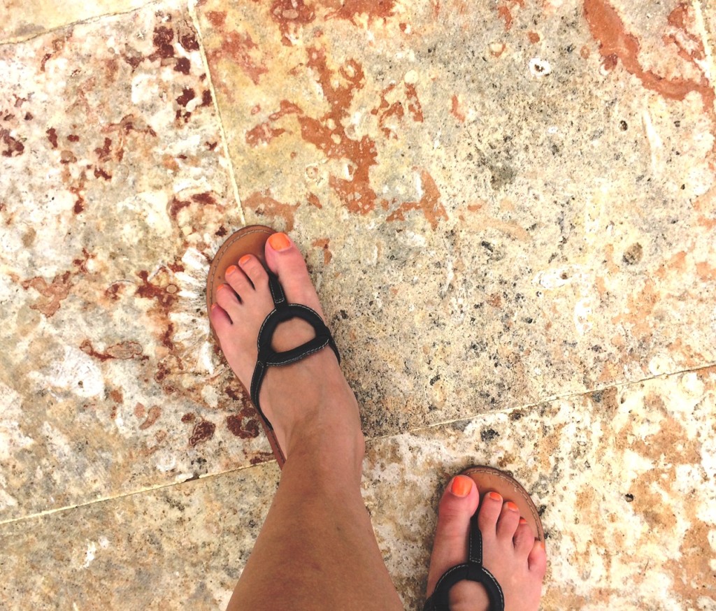
This summer my husband and I went to a Caribbean island for a little R&R. This gorgeous and brand new facility was one of those fantastic all-inclusive resorts you see all over the Caribbean now and we had a great time, a little slipping notwithstanding.
Trotting around the pool on the beautiful tiles they had with imprints of shells and fossils, I hit a wet spot on an incline outside the bathroom and went down! Whoops! In the process I sprained my left pinky toe so it was purple by the following morning; no beach volleyball for me! This was a minor dent in my vacation, but is a great example of why areas prone to standing water and wetness (especially in our litigation-prone society) require slip resistant tiles.
2010 ADA Standards for Accessible Design (ADA stands for the Americans with Disabilities Act, which is NOT applicable in our neighboring small Spanish-speaking islands) states in 302.1 that “Floor and ground surfaces shall be stable, firm, and slip resistant” and “A slip resistant surface provides sufficient frictional counterforce to the forces exerted in walking to permit safe ambulation.” (Yes, Interior Designers have to be able to read “Legalese” as it is written into Building Codes and Guidelines.)
Most often meeting this requirement means checking what is called Coefficient of Friction (COF) of the flooring. COF is a number on a zero 10 one scale that is the result of one of several possible tests, most commonly performed for ceramic and porcelain tiles. The metric is presented as a decimal number less than 1 and generally above 0.5 is considered slip resistant enough for most general code. ADA, however is a little more stringent and generally desires 0.6 for flat surfaces and 0.8 for ramps.
Its also important to note the condition of the test. In the last few years, the Tile Council of North America has made this testing program more rigorous by separating results into Wet or Dry, Dynamic or Static COFs to differentiate between testing conditions. A Dry/Static COF is always higher than its Wet/Dynamic counterpart and if you only have one listed (which is becoming more rare) assume it’s dry and consider how wet the space is likely to get before deciding that your COF is good enough.
After my slip I went on with my vacation, my toe a reminder of the importance Americans place on safety over beauty. Or I could be cynical a say the importance Americans place on avoiding legal ramifications. Either way, it reminded me of standards that architects and designers in the US are held to that other countries don’t enforce (and vice versa: many European countries have codes that workspaces be no more than X distance from a window. This requires that no one work in a windowless underbelly of a sprawling 40+ year old monstrosity). For good or bad, knowing the Coefficient of Friction of the tile going in your new bathroom just might be important to you. It will be important on my next project!
When I introduce myself to new people, at social gatherings or in public places, I used to say “I’m an Interior Designer.” This would get me one of two responses, both of which, to my mind, misunderstand who I am and what I do everyday.
The first is “Oh, okay.” in a tone of voice that implies I’m not really working. Like the person I’m talking to is just a capable of doing my job or (worse) thinks he/she can do it better. This would usually require a long winded defense of my profession that the situation doesn’t provide time to get into. If given time, I can go on about how I am not only an expert in color and style, but building codes and regulation, the basics of plumbing, electrics, HVAC, construction and probably more than you EVER want to hear on ADA (Americans with Disabilities Act) and it’s effect on buildings. I can also pop off on a little diatribe on LEED and the USGBC, as I am a LEED Green Associate, but that is taking it way too far for the average wedding cocktail hour.
The second, is “OMG! You have to help me! I have no idea what color to paint my Kitchen/Bedroom/Laundry/Kid’s Tree House/Dog’s Special Hiding Place!” and that is almost as bad. It speaks of respect and gives me credit for the massive time and energy I’ve taken to learn my craft, but only in a HGTV sort of way. Outside of my own home I don’t work on residential projects. While they are buildings and still require similar creative process and skills, commercial and residential design are radically different. A Fire Inspector is not going to care what your home draperies are made of. In a hospital or other health institution, however, they care a LOT. There are standards of testing and codes guiding what kinds of textiles can be used in hotels, hospitals and other commercial buildings that a home are not subject to. So while I appreciate and agree with my new friend’s perspective, it again misunderstands a large portion of the research I do everyday and I’m again tempted to lead off on the same diatribe inspired by answer #1.
My new answer to the question: “So what do you do?” is: “I’m a Commercial Interior Designer.” This mouthful does not trip off the tongue as easily as its predecessor, but it is much more effective in provoking a thoughtful response. “You mean like offices?” “Yes,” I say, “Like offices and healthcare environments. My firm does a lot of work with assisted living communities for seniors, who want a homey feel, but require hospital performance.” I like the assisted living example because most people know that senior environments do require wheelchair accessibility without getting into talking about ADA, cleanliness without talking about antimicrobial properties of finishes, and good lighting without talking about electric planning. It gives a greater sense of the responsibility and accountability required without removing the residential-looking framework with which people usually view the profession.
My point is that the next rehearsal dinner you attend, if are seated next to a stranger who says they are an Interior Designer, then maybe your next question should be: “What kind of work do you do?” It gives them more room to avoid the stereotype that, I believe, guides both answers #1 and #2: That I do residential work and my highest ambition is to design Eva Longoria’s next condo in the Caribbean and have it featured in Architectural Digest. No offense to Conde Nast’s classic, but I don’t even read Architectural Digest. (For reference, I choose Contract, Greensource, or Interior Design if I have time to pick up a periodical) Your new friend will appreciate the interest and the courtesy offered by not assuming.
Lately we’ve been asking our clients, not just about their space needs and storage, but acoustical privacy needs. But what exactly are we asking?
No cubical or wall partition systems, or even drywall constructed wall, will insulate your voice entirely from your neighbor if you want to be heard. But what about when you don’t want to be heard? The use of wall partitions and tall cubicles have many advantages for the workplace: they provide a sense of private, individual space. They are easier to relocate and renovate as teams needs change when compared to drywall. Some versions can include electrical and other utility disciplines into their framework thereby speeding up the construction timeline and getting you moved in faster. Finally they can be very cost effective compared to traditional drywall construction when handled correctly. These are reasons for their use and why many of our clients are considering them as a solution in their workplaces. But what most wall systems will not provide is the same level of acoustical privacy that you might except when isolated in your own “room” as you might expect from drywall construction. These systems don’t usually provide isolation from other noises and voices as you might expect.
Complete and total acoustical isolation (think soundproof booths used for recording artists) is a more costly process than traditional drywall construction. There are tricks to minimize it; such as sound masking as described in this Facilitiesnet article.
Sound masking is a tool that can be used after your walls are built to control noise. Simply put, rather than trying to remove all noise, sound masking systems provide a little extra background noise, so that the level of noise need to become audible is higher. These systems can be concealed in a ceiling and added after the fact, making them a potential solution in existing spaces where construction solutions aren’t an option.
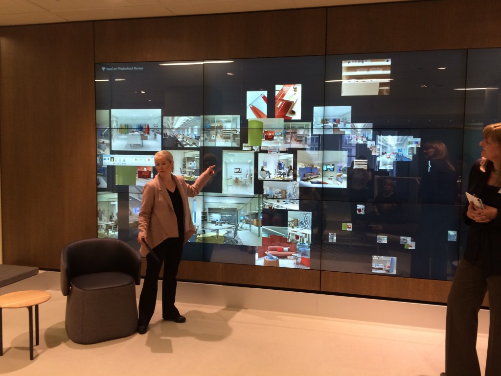
NeoCon, if you’ve never heard of it, is the Interior Design community’s best-know trade show. It takes place at the Merchandise Mart in Chicago (the building was, before the Pentagon, the largest in the world in terms of square footage, was owned by the Kennedy family for some time, and used to have its own zip code; facts I picked up taking one of the Architectural Riverboat Tours of Chicago. Check out Wikipedia for more on this fascinating building) and show takes place in June. NeoCon has also spawned, like mushrooms, offshoots NeoCon East in Baltimore, NeoCon West, NeoCon South… you get the idea.
But the Chicago show is the main event, the mother ship. Many furniture and finish companies launch new lines or show off their newest prototypes at NeoCon. The showrooms span several of the building’s floors (floors 11, 10, 8, 7, and 3 house much of the show and veterans attendees often recommend first timers start at the top floor and take the stairs down; the elevators can get packed) displaying products in both trade booths brought in for the occasion and the many showrooms that provide daily living space to much of Chicago’s commercial (and residential) design manufacturers.
So rather than continuing to explain the event, I’ll get on to a few photos from the various showrooms and booths that caught my attention.
Haworth is always looking to the future and I’d love this to be my corner office someday! The soft freestanding partitions are a prototype for enclosing both lounge and office spaces. Their focus on technology integration is also highlighted by the media wall their showroom sported.
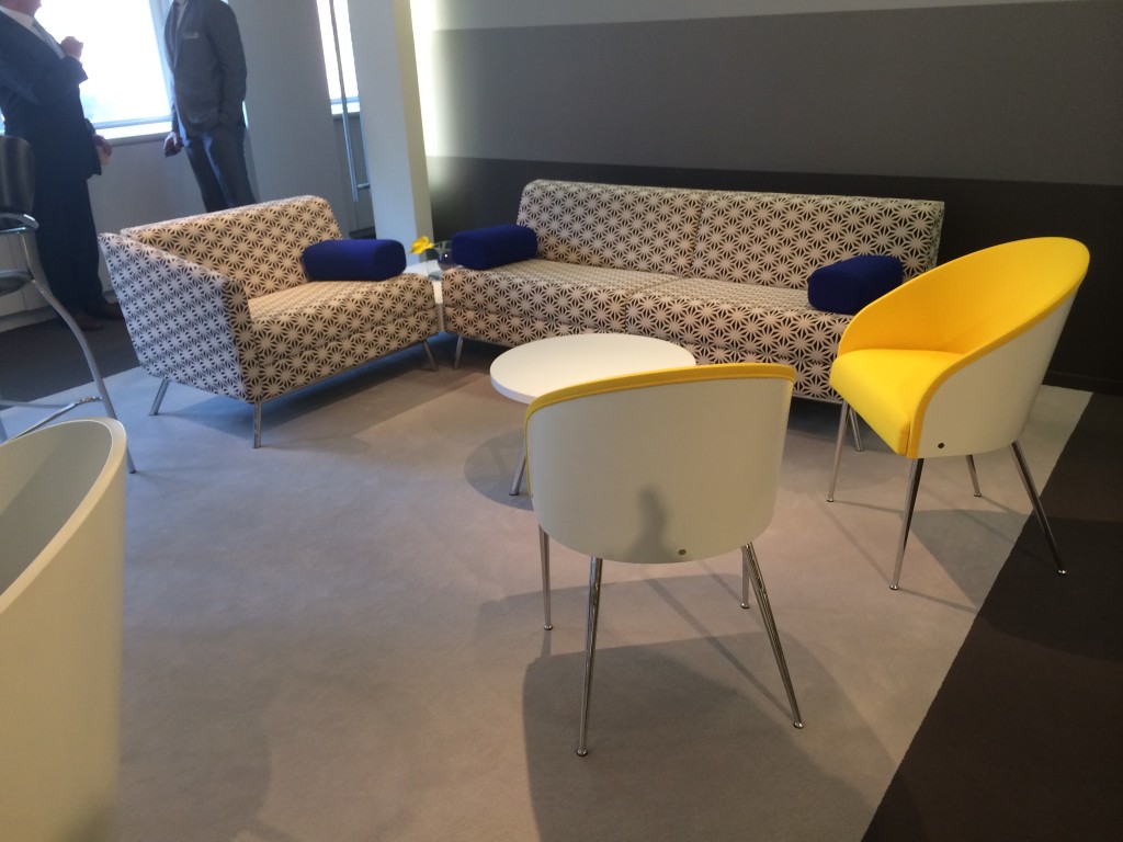
Global shows off some lovely existing pieces of their lines with a stunning White, Yellow & Cobalt showroom that caught my attention with it’s bold quality.
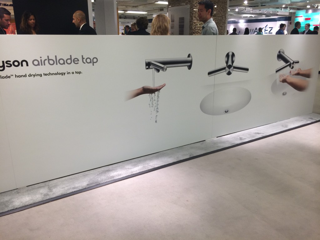
Dyson introduces a new brainwave for bathrooms: a faucet that combines the tap with the hand dryer unit. A clever idea that might be something useful in large, public bathrooms to avoid drips on the floor.
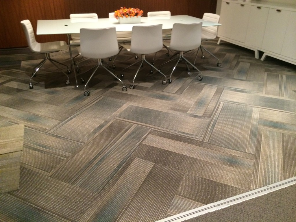
J&J Invision carpets show off a lovely ombre carpet tile laid out in a houndstooth pattern to great effect. I don’t believe is on the market yet, but I know I’ll be on the lookout!
Janus et Cie, well know for outdoor furniture, shows off a lovely “woven” loveseat (and matching chair)
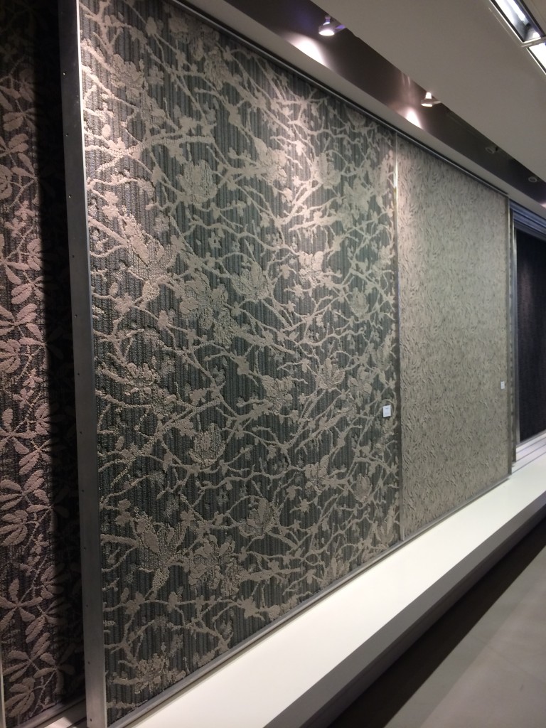
Masland Contract showing off a fantastic Hospitality/Assisted Living carpet collect. The Milestone collection combines Asian-inspired traditional patterns with fresh, modern colors
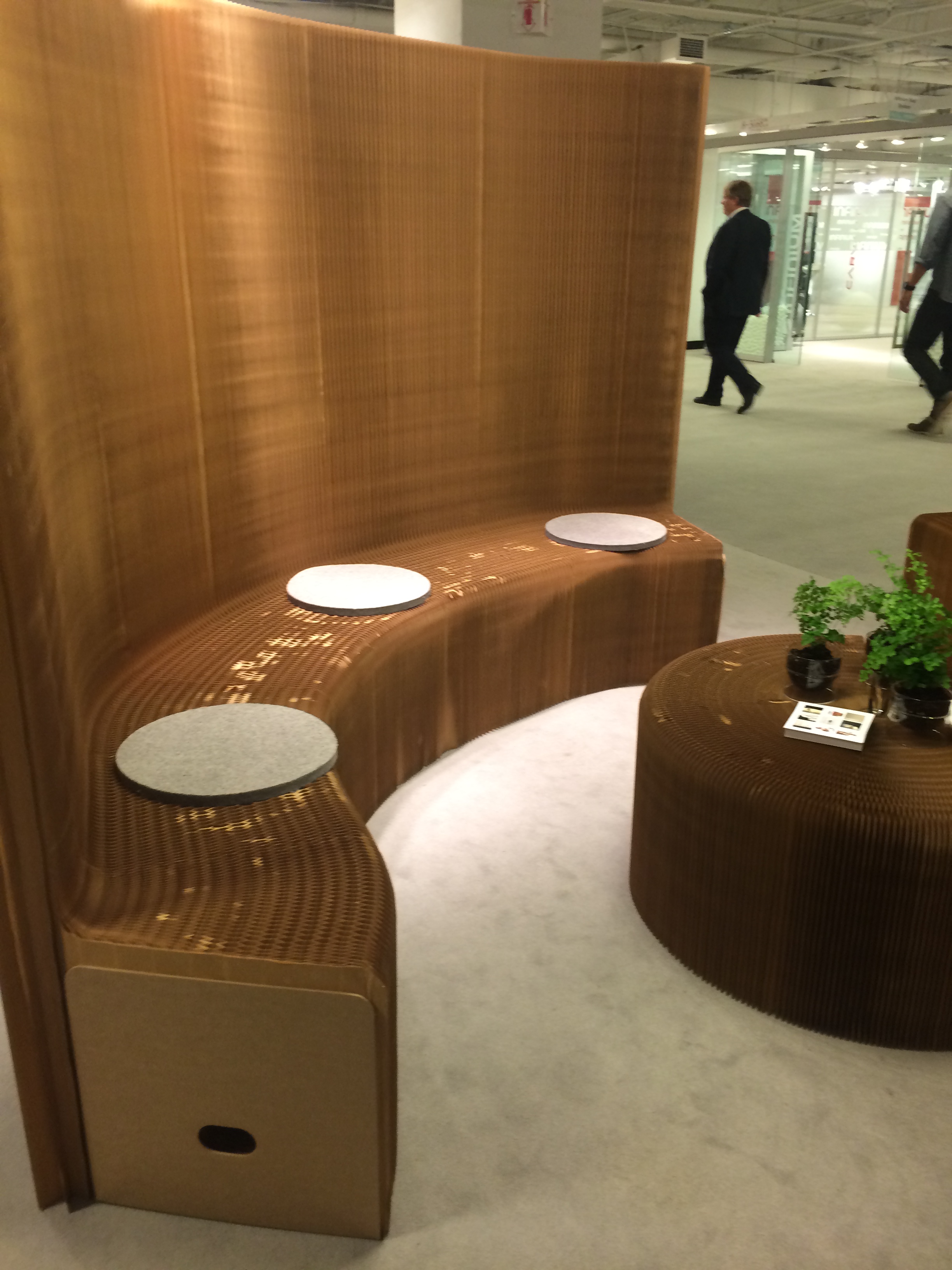
Throughout the show, not only at their own booth but down at Check in were clever little cardboard rounds from Molo. Taking the Pop-Up shop idea to a whole new level.
 This summer my husband and I went to a Caribbean island for a little R&R. This gorgeous and brand new facility was one of those fantastic all-inclusive resorts you see all over the Caribbean now and we had a great time, a little slipping notwithstanding.
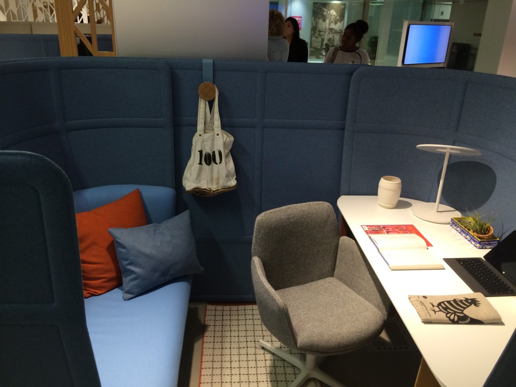
 J&J Invision carpets show off a lovely ombre carpet tile laid out in a houndstooth pattern to great effect. I don’t believe is on the market yet, but I know I’ll be on the lookout!